WOTD Remake - Alune redesing ❤
Hello everyone!

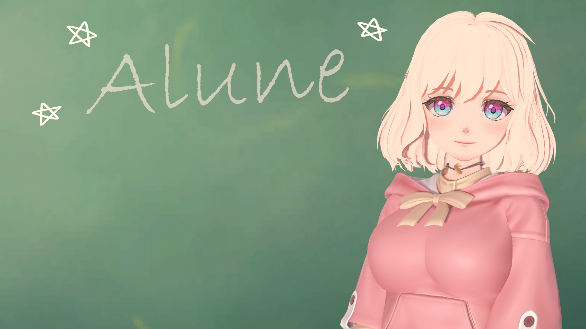
This is a small announcement to let you know that I just created a new public post on Patreon, which is the presentation of the redesign of Alune!
Post: https://www.patreon.com/posts/wotd-alune-part-108444105
It is a very complete post where I show the changes and talk a little about the new plans or ideas for the character, something I also did in the other posts about the new designs. I hope you like it!
Now I'll be working on Alune's new outfits, and after that on the redesign of Bonnie or Clyde, or maybe a new mysterious character I have planned.
That's all for now!
Farewell, and may Ceina bless you! ❤
~Vermelion
▃▃▃▃▃▃▃▃▃▃▃▃▃▃▃▃▃▃▃▃▃▃▃▃▃▃▃▃▃▃▃
¡Hola a todos!

Este es un pequeño anuncio para comunicarles que acabo de crear un nuevo post publico en Patreon, el cual es la presentación del rediseño de Alune!
Post: https://www.patreon.com/posts/wotd-alune-part-108444105
Es un post muy completo donde muestro los cambios y hablo un poco sobre los nuevos planes o ideas para el personaje, algo que también hice en los demás posts de los nuevos diseños. ¡Espero que les guste mucho!
Ahora estaré trabajando en los nuevos outfits de Alune, y luego de eso en el rediseño de Bonnie o Clyde, o tal vez en un nuevo y misterioso personaje que tengo planeado.
¡Eso es todo por ahora!
¡Hasta pronto, y que Ceina los bendiga! ❤
~Vermelion
Get Winds of the Destiny
Winds of the Destiny
| Status | In development |
| Author | Vermelion |
| Genre | Visual Novel |
| Tags | 3D, Adult, Anime, harem, Hentai, koikatsu, loli, NSFW, Romance |
| Languages | English, Spanish; Latin America |
| Accessibility | One button |
More posts
- WOTD - v0.12.0 now available for everyone!70 days ago
- ❤ Happy WOTD 5th Anniversary! ❤Mar 21, 2025
- WOTD Remake - Asagi redesing ❤Aug 04, 2024
- WOTD - v0.12.0 now available for Paladins!May 23, 2024
- Winds of the Destiny - Version 0.11.0 now available to everyone!Apr 13, 2024
- Happy WOTD 4th Anniversary! And V0.11.0 now available for Angels!Mar 20, 2024
- Patreon page update and more info!Jan 26, 2024
- Merry Christmas and Fan Art Contest 2023!Dec 24, 2023
- Winds of the Destiny - Version 0.10.0 now available to everyone!Dec 24, 2023

Comments
Log in with itch.io to leave a comment.
Truth be told, I don't really like the redesign. I tired to give it time, and look at it with fresh eyes. I looked for minor details that I may like, and I can't find a reason to like it.
What bothers me the most would be her eyes. I noticed while looking for details, that she has little flower patterns in her eyes. I really don't like that along with her new thicker eyelashes. Honestly, there is too much details compared to the rest of her design that it is distracting and doesn't fit her character.
Her outfit also bothers me. I liked the open hoodie, with the uniform underneath, but this new one does not look good. The hoodie is has no zipper and seems to cover the uniform, except for the bowtie for some reason? Like did she tie the bowtie, put on the hoodie, then pulled out the bowtie to show it off? Why? Also, it seems like the hoodie is a short sleeve hoodie with some sort of clips on the end that seems to have no use. Why is it short sleeved as well? It just looks wrong, especially with its front pocket so high up. Why does it go al the way up to her bust?
Speaking of bust, it just doesn't look right. They look padded or that she is wearing a pushup bra. There is no natural sag. Looking at the Patreon post, they look look to be slightly larger than in the old design, but as a comment below has said, they look too big for her.
Speaking of the side by side Patreon images. The new design is too shiny. I get that she is supposed to look more "angelic" but that was accomplished by lightening her hair color. The extra shine on her skin is too much and can hurt the eyes to look at.
I can see a lot of work has gone into the redesign, and it is very well made. But some of the decisions I feel like are a step back than a step forward. I do love your game, and I want to see it get even better, so I am sorry if my critics sounded harsh. I only want to make the game to be better.
Additionally
As I was writing my first comment out, I took a look at the Patreon images. Which caused me to change an earlier paragraph and add a new one. I just wanted to add that I noticed the bowtie is actually the strings of the hoodie. I believed the design above would be her normal school outfit she normally has. So I was very confused why it did not resemble the school outfit at all.
As I was looking at the Patreon images, I did actually find a new detail about her that I liked. Her painted nails. It adds to her character quite a bit. Though it makes the details of the flowers in her eyes worse. It makes it redundant to have flowers in both her eyes and nails.
Also, looking at the side by side. I do like the decision to keep her hair as being slightly messy.
I like her. But boobs too big for her...